
Late last week Google Maps debuted a new feature that incorporates accessibility information into entries about individual business and locations. The feature, which was created by a group of Google employees during their 20% time, works by asking Google Maps users to weigh in about the accessibility of locations they visit and then adding this information to the entry for the location in Google Maps.
This is a nice feature that is sure to be useful to many people, particularly given the popularity of Google Maps, but I want to discuss some current limitations of the feature. First, and perhaps most notably, the feature does not appear to be included in the desktop version of Google Maps. While this may seem like a minor issue, it does mean that accessibility information is only available to those who have access to a mobile device and is not as easily available for those who are using a desktop to plan in advance of visiting a location.
In addition, all of the content is generated by “Local Guides,” who are Google Maps users who are willing to add information on accessibility to the entries for places that they visit. Though crowdsourcing this information from Google Maps users allows Google to quickly aggregate content for the feature, this means that this information is based on varying levels of understanding of accessibility and is not necessarily detailed or based on legal standards. For example, the entries I have seen focus on whether the entrance is accessible, but it’s not clear what this means: does it take into account door width and the steepness of any available ramp? These entries also don’t mention other aspects of accessibility, such as accessible bathrooms or features for individuals with other types of disabilities.
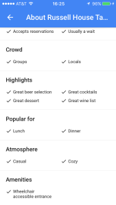
Finally, finding accessibility information requires users to go to the full “About” page for the location. Once there, the information is listed under “Amenities.” This isn’t ideal for a couple of reasons. First, accessibility information seems to be listed only if it is available. If there is no accessibility information for a location, there doesn’t seem to be a way to tell if that is because the location isn’t accessible or simply because no information has been added yet. As noted in my Twitter conversation with Frank Skornia and Kate Deibel (see below), it seems that what is missing is a way to flag places that aren’t accessible.
@CarliSpina @metageeky It may be better for Google to list as a red flag the places that are not wheelchair accessible
— Frank Skornia (@FSkornia) December 15, 2016
@FSkornia @CarliSpina Or at least a feature that would put flags up if you said mark inaccessible places.
— Kate Deibel (@metageeky) December 15, 2016
Also, because this information isn’t on the main page, many users may never find it, even if they are looking for it. One additional note: listing accessibility as an ‘amenity’ seems like an odd choice that frames accessibility features as a bonus even though in reality they are often a legal requirement. Both of these final items might be addressed by making accessibility a separate category, preferably more prominently placed.
Overall, I’m glad that Google decided to add this feature to Google Maps, but I hope they continue to expand and refine it to make it more useful and reliable. (Special thanks to Frank Skornia and Kate Deibel for discussing this with me on Twitter.)
After careful consideration, I’ve decided to extend my break from this blog. In addition to moving to a new job last winter, I’ve started teaching more and writing in other venues. I’m also just starting a term as Chair of LITA’s new Diversity and Inclusion Committee. With all of these new responsibilities, I’ve decided to focus my efforts elsewhere for now. I’ve really enjoyed writing for this blog and I’m guessing I’ll still post from time to time, but, in the meantime, if you would like to keep up with my work, check my website, my writing at SLJ.com, or my upcoming class for Library Juice Academy, Introduction to Accessibility and Universal Design.
 Emoji, memes, and GIFs are everywhere on the internet, but they don’t generally let you add a personalized touch to your communications. Bitmoji is a free app for iOS, Android, and Google Chrome that changes this. With Bitmoji you can create a wide range of emoji-like images that feature a personalized character that can be made to look as much (or as little) like yourself as you want.
The first step to using Bitmoji is creating your avatar. When you first use the app, you are walked through the process of selecting everything from hair color to face shape to body shape. Once you have the physical features finalized, you can also pick your character’s outfit, choosing from designer fashions, casual looks, or superhero costumes. Periodically, the app also features the option for seasonal outfits as well, such as a Christmas sweater in December. When your character is finalized, Bitmoji automatically generates a wide range of emoji featuring this new character. At this point, you can either install Bitmoji as another keyboard on your device to automatically use Bitmoji in your texting app (or other apps) or you can open the Bitmoji app each time you want to copy an image or use one of them in an app. The images are organized into different categories, though one of my biggest complaints is that it can be difficult to remember where each of the images is located. The images are cute and cover a wide enough range of interactions that it is practically possible to have a conversation entirely in Bitmoji images.
 Bitmoji features images and costumes related to popular culture, famous fashion designers, catch phrases, slang, and commonly used phrases. Each week, new free content is released, which keeps the app fresh and up-to-the-minute on many pop culture occurrences. It can be fun to play with ways to combine these into cute references, like this example of my avatar dressed as Batman with the caption “Treat Yo Self,” an Easter egg for Parks and Rec fans. Bitmoji is a fun app that offers a lot of cute options. It is a silly but entertaining way to bring some personality to your communications.
This week I also wanted to announce that this blog will be on hiatus until June of this year since I will be teaching some classes and traveling quite a bit for the next couple of months. I might post sporadically during this period, but I don’t plan to post on my regular schedule.
 If you are like me, you probably search for Wikipedia on your smartphone frequently. While Wikipedia’s mobile interface is very usable, the browser-based experience is not able to take advantage of all the features available to mobile apps. Viki is an iOS-specific app that offers a fully-featured Wikipedia experience that not only offers additional functionality beyond the browser-based experience, but also offers an attractive design that will make you even happier to use Wikipedia.
With Viki, every aspect of the experience is tailored to your iOS device. The app is designed to be extremely usable on iPhones, iPads, and even the Apple Watch, though this post focuses on the iPhone experience, which is where I think the app makes for a particularly nice navigation experience. You can search for content in Wikipedia using the search box at the top of the app, making the search very central to the app. Though it does not change the content of Wikipedia pages, it does change the order of the content to pull an overview of the article to the top of the page above the box of brief information that typically appears to the right of Wikipedia entries on a full-sized screen. For long articles, the article’s table of contents is available with a single click at the bottom right of the page screen, making it fast to navigate to the desired segment of the article. Using that same menu, you can also bookmark and share a page. In the upper right corner of the app, you can also quickly change the language of the article, which is great for both practicing your language skills and offering a better experience for those whose first language is not English. If you find yourself going to the same articles repeatedly, you will also be happy to find that Viki keeps a list of recently visited articles as well as those that you have bookmarked. Though Viki does not offer the ability to edit articles within the app, it does include a button that will automatically open the editing page for the article in Safari on your device, which makes this a minor inconvenience.
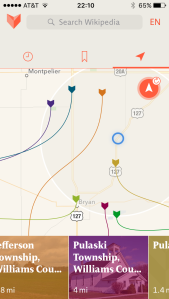
Though all of this is enough of a reason to use Viki, what really sets it apart for me is the way that it maps Wikipedia information. Using this feature, you can find all of the Wikipedia articles that are tied to a particular location, either by zooming in to this location on the map within the app or by allowing the app to automatically detect your location to serve up information about places near your current location. The look of this segment of the app is engaging and easy to understand, as you can see in the image above. It is a great way to find out about your current location or to plan an upcoming trip to a new area. All of this taken together makes Viki a fun way to use Wikipedia and well worth the $1.99 price tag if you frequently use Wikipedia on your iOS device.
 TileAcademy is a new resource that allows users to create simple pages for collecting and sharing resources. Still in Beta, this application is geared towards those in the education field and places a particular focus on features that make it useful and useable for teachers in a variety of educational settings.
The idea behind TileAcademy is fairly simple. You create “Walls” that collect your resources. These resources can be almost anything you can think of: links to websites (which will either have an automatic image or one you add yourself), text, images, content from cloud services including Office 365, DropBox, Google Drive, and OneDrive, Android or iOS apps, or even content from your institution’s server if you are working on an account affiliated with a particular school. You can also search across other TileAcademy users’ content and pull in their public items with a single click. In addition to this ease of adding items to your Wall, you can also change the look of your Wall by choosing from multiple possible layouts or backgrounds.
Though TileAcademy is useful to keep track of items for your own use, its real purpose is to facilitate sharing these items with others. If you make your page public, this can be done through TileAcademy’s search feature. However, the primary purpose of sharing these resources is to streamline the process of sharing items with students in the classroom or beyond its walls. As part of this functionality, users can use the single-sign-in feature to save passwords for applications on their Wall to make it easier for students to login without needing to remember multiple passwords. Walls can be shared via a link, QR code, email, or social media from within the application to facilitate sharing content with students. Walls can also be public, hidden so that users need the URL to find them, password protected, or completely private so that only invited users can access them. Though it is hardly the only tool with this focus, TileAcademy does offer nice features that make it a good option for teachers and librarians looking for a free tool for this purpose.
 The idea of making reading social is not a new one. Tools such as Goodreads and LibraryThing already offer tools for sharing your reading with your friends. Litsy is a new app that is aimed at a similar market, but offers some nice new features. Unlike many of the other social tools for reading, Litsy is solely a mobile app, which is available for free for iOS devices.
Once you have installed the app, you can start an account either through Facebook or by creating an account. The app takes a visual approach to book sharing by encouraging users to share photos of the books that they are reading. There are three types of posts that users can make, each of which includes the option for both a photo and text. Quotes and Blurbs each include the option to tag people in your post and state whether or not it contains any spoilers. A Review post includes all of these elements and four rating options: Pick, 50-50, Pan, or Bailed. You can navigate through content either on a Home tab, which shows posts in chronological order or by searching by either book or user. You can also follow people to keep up with their activities and users can send notifications to each other within the app as well. As you are reading posts, you can opt to favorite them, comment on them, or add the book to you Have Read or To Read lists. Along the way, if anyone likes, comments on, or adds a book to their lists from your posts you can earn points that make up your “Litfluence” and shows the impact you are having on the reading community around you. When you first join Litsy, your score is 42 (a subtle nod to The Hitchhiker’s Guide to the Galaxy) so that you don’t have to work your way up from zero. Litsy is a fun new option for talking about books online and it has a very nice user interface that makes it cute and easy to use. If you are a reader who likes to discuss what you read with friends, this is a nice alternative.
 Whether you are just planning your day or you are planning a vacation in a foreign country, finding information about the accessibility of hotels, restaurants, stores, and other public venues can be extremely difficult. Though the internet has improved this process slightly, a surprising number of places still don’t offer accessibility information on their websites and those that do aren’t always accurate or detailed in their descriptions. Access Earth is a new website that aims to solve this problem by crowdsourcing this information.
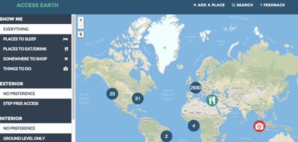
This site collects information about locations around the world and makes it easy to sort through types of venues (including categories for hotels, restaurants/bars, shopping, and local sights) and types of accommodations needed (such as step-free access, elevators, or accessible restrooms). Alternatively, you can also search for specific places by name. On the map, each location has either a green icon, indicating that it is accessible, or a a red icon, indicating that there are accessibility issues. For each individual venue, users can add basic information, such as contact details, as well as answers to four specific accessibility questions: is the entrance step free, are the doors wide enough to allow wheelchair access, are all public areas at ground level, and are there accessible bathrooms available. Users can also add reviews for each venue to provide more anecdotal information.
The site is built using OpenStreetMap and Mapbox, which provides a nice, easy to use map interface that allows users to zoom in to find all of the accessible venues in a specific location, but this is not the only way to navigate through the site’s information. You can also click on categories in the left menu (seen in the image below) to narrow your results to specific types of venues. At this point, the site’s contents are weighted heavily towards Europe and the UK, but I hope that this will change over time as more non-European users begin contributing to the site.
Overall, I like Access Earth with two reservations. Though the site is nice and easy to use, it is currently focused on access for those with mobility disabilities, a bit to the exclusion of other types of disabilities, though this may be a function of being in beta and having a limited user base at this point. Also, one other issue I will note is that the site itself has some accessibility issues, which may make it difficult to navigate for those who use certain assistive technologies, but I am hoping this will also improve as the site continues to develop and eventually moves out of beta. If you are interested in finding or sharing information about location accessibility, Access Earth is a nice new option. In particular, I would encourage librarians to consider adding information about their library to the site!
Interested in learning about other accessibility tools? Sign up for my Library Juice Academy course: Introduction to Accessibility and Universal Design.
 Have you ever wanted to make your to-do list a bit more dramatic? A bit more fun? Victories is a new app that will help with this process. Despite having many features found in a standard mobile to-do list app, Victories differentiates itself by adding game elements to the process.
When you first set up the app, you are asked to decide whether you wish to be a king or a queen. Once you have decided, you are then given a selection of 8-bit style characters to select from. This character starts as a lowly peasant, but as you complete items on your to-do list, you can earn points to level your character up over time. Completing an item on your list is a battle that you have “won” and any items you remove from your list without completing them are “surrenders.” The app not only grants you points for completing tasks, but also tracks stats on time spent between battles and “conquests” which are to-do lists taken as a whole.
These are the fun elements of the app, but the mechanics of the to-do list features are also important. The app uses simple gestures that will be familiar to those who have used other mobile to-do list apps. Adding a task only requires double tapping on the screen, at which point you can type multiple tasks with double space in between them or you can include notes on individual items by only a single space. When you complete an item on the list, you simply swipe to the right to “win” that battle and earn your points. Items that you no longer want to complete can be removed by swiping left. The mechanics of the app work well and when combined with the cute graphics and entertaining point system, make this a nice option for users who think a sense of competition will motivate them to complete tasks.
Rather than simply sticking with its initial focus on still photos, Instagram has continued to branch out to offer new types of content creation and sharing. The latest of these new features is Boomerang. This app, which is available for both iOS and Android devices, allows for video creation with a twist: the resulting videos play both backwards and forwards to create a continuous loop, but one that looks much different than a standard looping GIF or video.
The app itself has an easy-to-use interface that is not unlike Instagram’s other apps. You simply touch a button on your screen to record. As soon as you release the button, the video recording stops and are you automatically taken to a preview of your completed loop. You can record either a “boomerang,” which refers to video taken with the camera on the back of your device, or a “selfieboom,” which refers to video taken with the camera on the face of your device. That choice and whether or not to use your device’s flash are the only options that the app gives you when creating your video. Completed videos can be saved, shared on Instagram or Facebook, or passed along to another app on your phone. The entire experience is quick and intuitive. In truth, my sole complaint about Boomerang and Instagram’s other similar content creation apps is that they silo all of these features in separate apps rather than bringing them together into a single experience. However, given that all of the apps released so far have been free, this is a fairly minor complaint. If you enjoy creating video content and sharing it on social media, Boomerang is a fun new tool. You can see the app in action below.
Last fall I wrote about Google’s new Voice Typing feature. This tool brought fairly high-quality dictation options to Google Docs, which was a very impressive new addition. On February 24th, this feature was significantly expanded to allow you to not only dictate text but to also edit your document through voice commands as well.
These new features allow you to navigate through your document to make changes and additions to earlier sections of your work as well as making it easy to add formatting as you go along without ever touching your keyboard. Using this tool you can do everything from cutting and pasting text, to adding equations to your file, to inserting tables. To do this, you will need to be familiar with a lengthy list of commands, but fortunately many of them are quite intuitive. As with most all current dictation and voice command tools, this is not perfect and does require a specific set of circumstances, such as a decent quality microphone (though you may be able to use the one built into your device) and a room without too much background noise. However, the tool is impressive, particularly for those who are looking for a free/low-cost option for dictation or voice command software. It is definitely worth a try. You can check out this tool in action in the video below:
